
Intro To Google Resizer
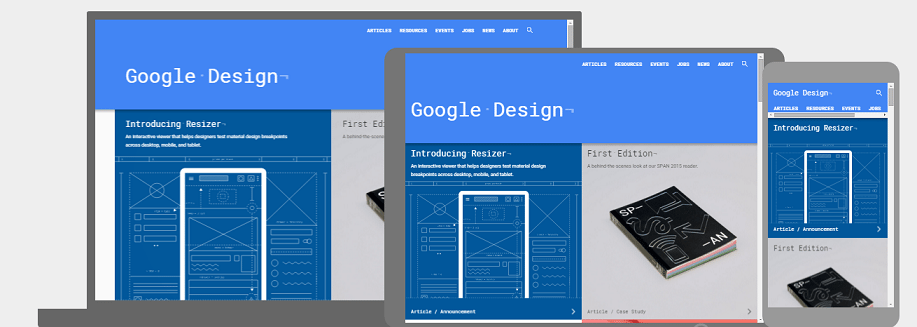
Google has a new interactive web design tool dubbed Google Resizer. The new tool lets website designers and developers to test web pages across desktop, mobile and tablet for their material design breakpoints. It dynamically tests whether the user interface is responsive enough and that it follows the Material Design guidelines with different screen sizes and different resolutions. With this tool, developers can explore different patterns for elements displayed on the screen.
Material Design
With Android Lollipop, Google has introduced the design language called Material Design. The company has since been updating their apps to follow these guidelines. Though these guidelines are shared with third-party developers as well but is quite challenging. Material Design is all about providing a similar experience to the users across many devices. Google Resizer aims at providing a simple and fun way to test your website across tablet, desktop and phone.
Using this Tool
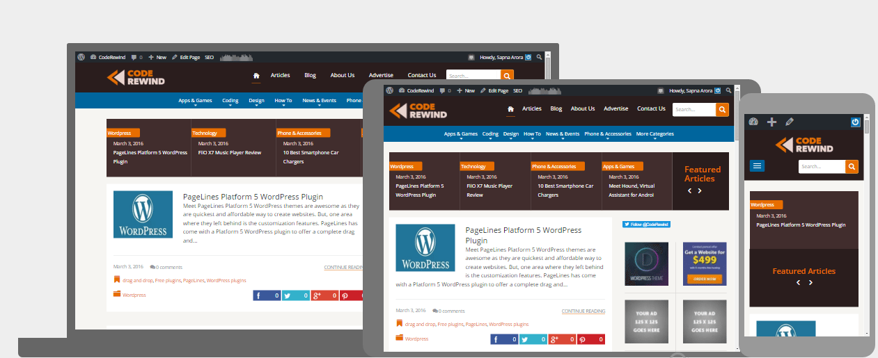
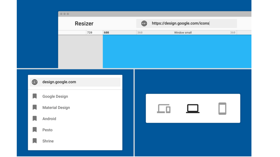
Resizer comes with the ability to test material design across platforms and shows you in real time, if the site is responsive for mobile. To use this tool, input a URL and you can toggle between desktop or mobile experiences. This interactive tool tests for desktop and mobile, side-by-side. It also has a few default URLs in the input bar where you can get an idea of Google’s best practices.
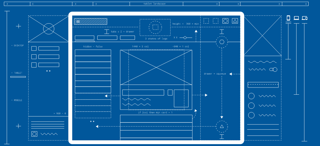
Interactive Layouts
It renders any website URL into three layouts: desktop, tablet and mobile. All three are interactive and you can scroll and click independently in each of them. You can use the upper toolbar to switch desktop view or mobile view exclusively. A small toolbar shows up with different possible setups such as varying resolutions on desktops, tablet view, phone view, landscape orientation or portrait orientation on mobile and lots more.
Wrapping Up
Most web developers use developer tools available in Chrome and Firefox to test their website for different resolutions. These tools also allow you to simulate touch displays and test a programmed gesture control as well. Google Resizer only tests responsive designs. It is an excellent tool to present responsive design to the client. The tool is easy to operate and does not require any necessary knowledge of developer tools.
It is super easy to use this interactive tool and could be a time saver when you just want to see how adaptive your website is. You can check out Google Resizer here.
Web designers can also have a look at top wireframing tools.
To wrap up, Resizer is a fast option to check a responsive web layout on its correct display.
What are your thoughts about Google Resizer Tool? Are you going to use it? Share your thoughts with us in the comments.