With the arrival and popularity of Responsive Web Design (RWD), the testing efforts also need to be increased. To provide quality mobile experience to your customers and subscribers, it is essential to make your website responsive. The good news is that there are a plenty of options that let you test responsive web design of your site and see how it appears across different mobile devices.
[leaderad]
Most of you know the Ctrl + Shift + M trick to check responsive design in Mozilla Firefox. There are also free online tools that provide you a better overview of how your website works across various devices.
Here, we have listed the top 5 free tools that let you test responsiveness of your website:
1) Responsinator
Responsinator is a quick and well-designed tool that lets you know the responsiveness of a website in various devices. Just enter the site URL for which you want to test the responsiveness and it will display results across all major devices. It is free to use and offer you instant results. It is one of the most popular tools to test responsive web design.
2) Deviceponsive
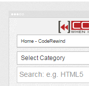
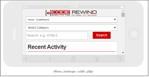
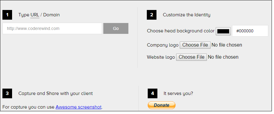
Deviceponsive displays your site across all devices on one long page. You can also customize the site header by editing header background color and embedding your logo. The various devices supported by this site include Macbook, Kindle Portrait, Kindle Landscape, iPhone portrait, Galaxy portrait and more. It is a good choice to check responsiveness of a website.
3) Reponsive.is
Responsive.is provides you a smooth animation from one display to another. The various device options available are auto, Tablet Landscape, Table Portrait, SmartPhone Landscape and Smartphone Portrait.

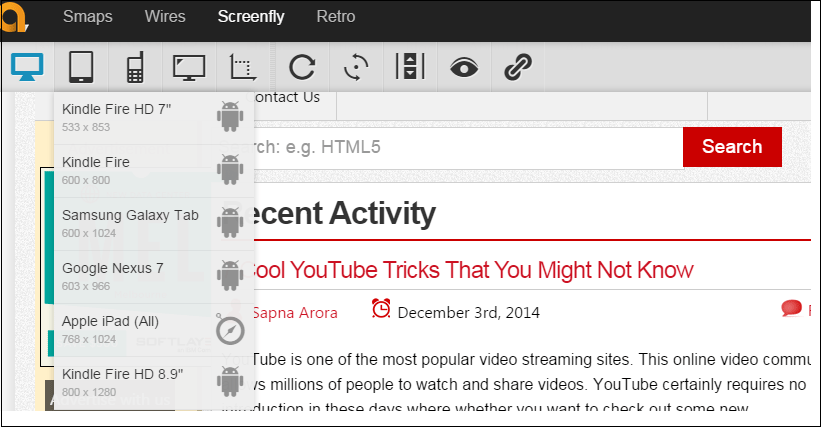
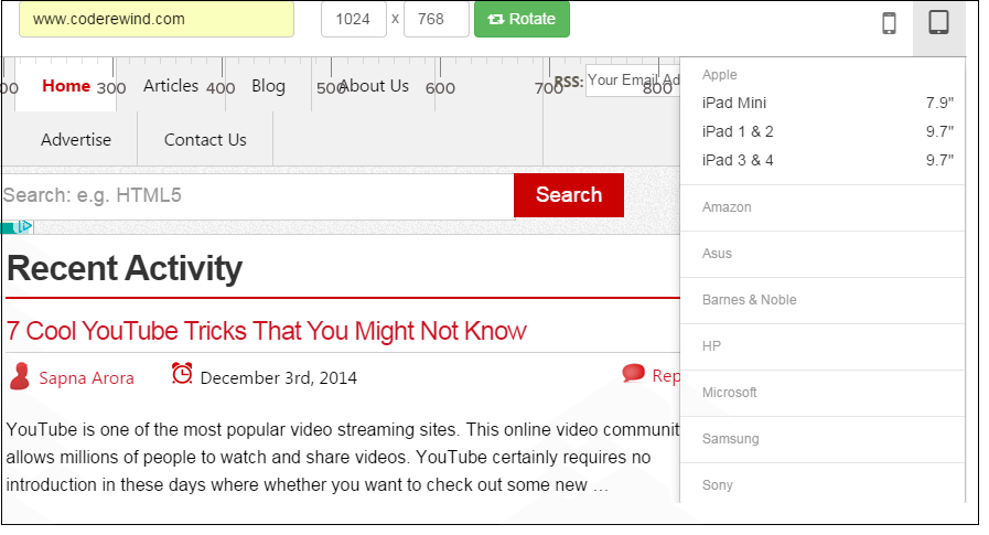
4) Screenfly
Screenfly is another browser-based tool that offers you multiple breakpoints such as mobile, tablet, desktop as well as TV. Also, you can rotate the display and enable scrolling on the webpage. It is a nice choice when you are looking for tools to test responsive web design. It offers you plenty of device options to choose from and see the responsiveness of your website.
5) Responsive Test
When we are talking about tools to test responsive web design, we cannot forget to include Responsive Test. You can choose the device from a simple menu at the top of the site from the plethora of options available. This free to use tool offers you a quick way to view your website across different devices to provide a better mobile experience to the users.
Which tool do you use to test responsive web design? Is that tool included in our list or do you have a different choice? Let us know your thoughts in the comments.